Picture this: You spend hours designing a stunning website—gorgeous fonts, eye-catching graphics, colors that make your soul sing—only to realize… no one is buying, signing up, or clicking anything. Ouch. If your website looks amazing but doesn’t convert visitors into customers, it’s like having a storefront with no cash register. Let’s fix that, shall we?
What Makes a Website High-Converting?
A high-converting website isn’t just pretty; it guides visitors like a well-lit path straight to your call to action (CTA). Every button, headline, and layout choice should be working for you, not against you.
1.) Clear, Compelling Headline (AKA The Hook)
People decide within 3-5 seconds whether they’ll stay on your site or peace out. Your headline should instantly tell them:
- What you do
- Who it’s for
- Why they should care
Example:
❌ “Welcome to My Website!” (yawn)
✔️ “Custom Reiki-Infused Jewelry That Elevates Your Energy” (yes, please!)
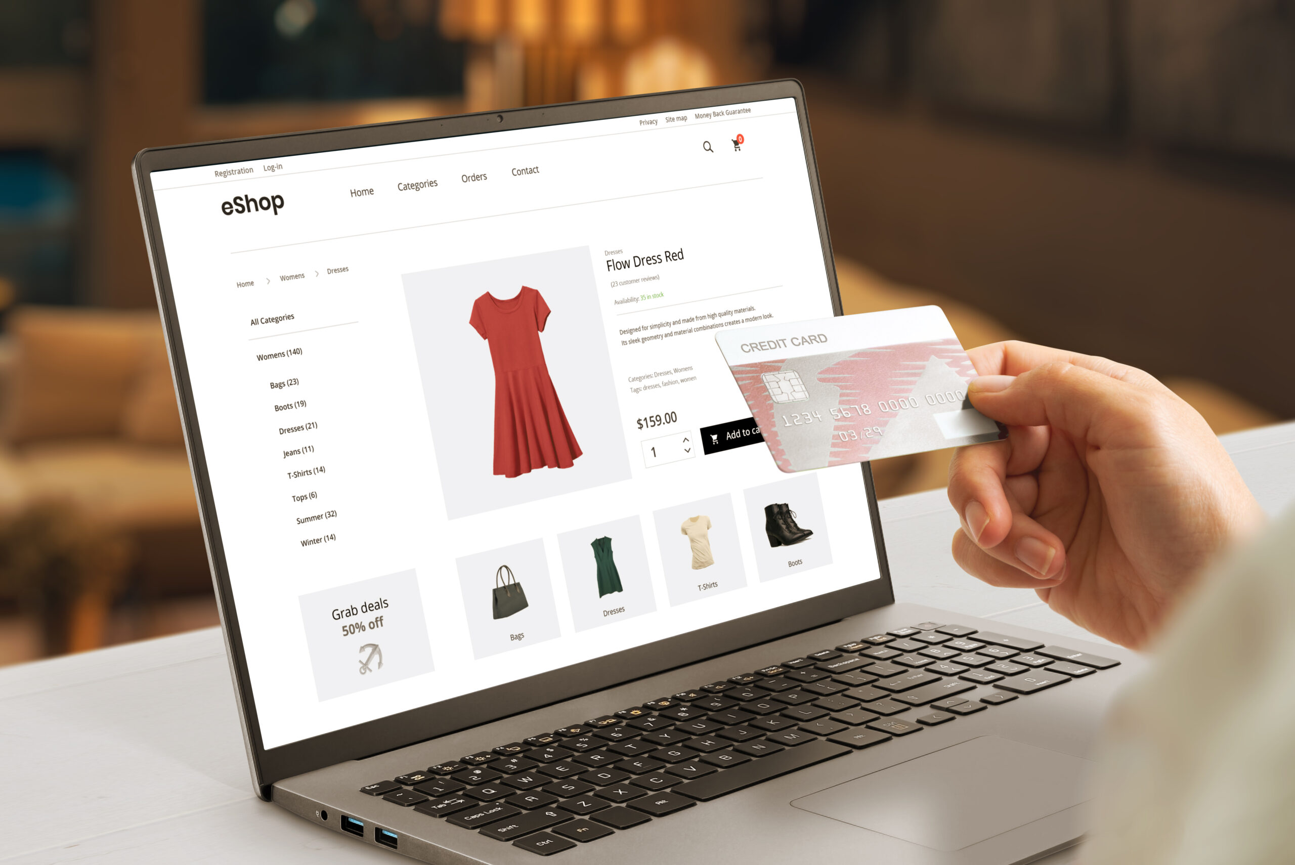
2.) Strong Call to Action (CTA)
Your CTA should be as obvious as a flashing neon sign in a dark alley—except, you know, less sketchy.
Bad CTA: “Click Here” (Where? Why? For what?)
Good CTA: “Download Your Free Guide to Chakra Healing” (Clear, enticing, and beneficial)
Pro Tip: Keep CTAs action-driven—”Shop Now,” “Book a Reading,” or “Join the VIP List” work better than passive buttons.
3.) Easy, No-Brainer Navigation
If your menu looks like a buffet with too many choices, visitors will get overwhelmed and leave. Stick to the essentials:
- Home
- About
- Shop/Services
- Blog (if applicable)
- Contact
No one should need a treasure map to find what they need.
4.) Fast Load Time (Because No One Has Patience Anymore)
A slow website is a conversion killer. If your site takes longer than 3 seconds to load, half your visitors will leave. Test your site speed with Google PageSpeed Insights and optimize your images, hosting, and plugins accordingly.
5.) Mobile Optimization is Non-Negotiable
Over 60% of web traffic comes from mobile devices. If your website looks great on a desktop but is a hot mess on mobile, you’re losing sales. Make sure:
- Text is readable without zooming
- Buttons are big enough to tap easily
- Images resize correctly
6.) Trust Signals (Because Skepticism is Real)
Nobody wants to get scammed. Add:
- Testimonials & reviews
- Security badges (if selling online)
- Social proof (like “Over 10,000 happy customers!”)
7.) Minimal Distractions
Your website shouldn’t look like Times Square—too many pop-ups, banners, and random animations will overwhelm visitors. Keep it clean, streamlined, and easy to navigate.
Final Thoughts
Your website isn’t just a digital business card—it’s a 24/7 salesperson. If it’s confusing, slow, or cluttered, people will leave. But if it’s clear, fast, and conversion-friendly, you’ll turn visitors into loyal customers faster than you can say “Check out now.”